I’ve been having some passionate conversations about “floating action buttons” which were introduced with Google material design.
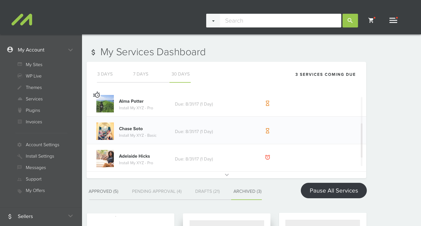
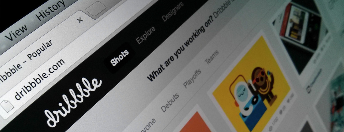
New MOJO services dashboard
Partly because the past 7-8 months we’ve been working towards launching what we’re calling V2 of MOJO Marketplace. With our existing product being more of an integration we haven’t focused as much as we wanted on our actual brand and product – MOJOMarketplace.com. My mind has been focused on crafting the perfect product for our users. Being a two-sided marketplaces where you’re trying to please both buyers & sellers, the task is even harder.
In my opinion, our creative team has found the perfect balance in utilizing material design into our new interface but that didn’t come without some heated conversations about design direction. More sneak peeks at Dribbble.
Google Material isn’t one size fits all.
I cringe at the site of floating action buttons being used in all types of applications and use cases. Over the past 2 years after the Google introduced material design, it’s definitely been a breath of fresh air but this has to stop before it turns into a hot mess.
Don’t get me wrong. I love material design. In fact, it’s amazing. It’s perfectly executed and thought through by it’s creators. It’s because of how much I love what material design is doing for the web that I would hate to see it become the next Twitter Bootstrap.
I’m so passionately against the FAB adoption across everything. Is it nice in specifics applications? Yes. But not everything.
— (@jrfarr) February 10, 2017
The FAB is FAB, just not all the time.
Let me explain. I’m not here to preach design principles, I’m here to make sure we’re designing responsibly if you will. I want to challenge the makers, the designers and the doers to think before your FAB. Just because we let Google do all the hard work and layout some beautiful design guide doesn’t give us the right to misuse it. Take time to read through the goals of material design.
For starters lets not have more than one FAB per screen. Again, if you take time to read through it all, it’s very well documented.
Usage: Only one floating action button is recommended per screen to represent the most common action.
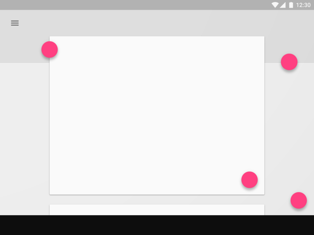
FAB’s for days
Consumption vs. Action
Lately I’ve been talking more about this concept a lot with my product & creative teams. I would argue with all the other 80/20 rules out there that same ratio has to be relevant when it comes to your users interacting with your product. 80% of the time users are consuming something while 20% of the time their taking action. Honestly, as I’m writing this, it could be 90/10.
When you’re designing your product or application think about the behavior on the screen. What is the user REALLY going to be doing inside your product? I’d bet they’re consuming more than they’re taking action.
Mobile vs. Web
This is where I feel like things are really starting to get out of hand. We’re taking these design principles from Google Material and polluting them into everyday web application.
Seriously why? I don’t get it.
Unless you’re InVision where you’re primary users are the designers pushing the web forward you have no business messing with FAB’s all over your web product.
Let’s just talk about Google themselves for second while we’re on this subject.
Let’s take one of their most popular products, Gmail.
I use Gmail everyday. While I’m working on my laptop I opt to use the web interface from Gmail. On my phone I use the Gmail app as well. With that being said, the experience from the web to mobile is drastically different.
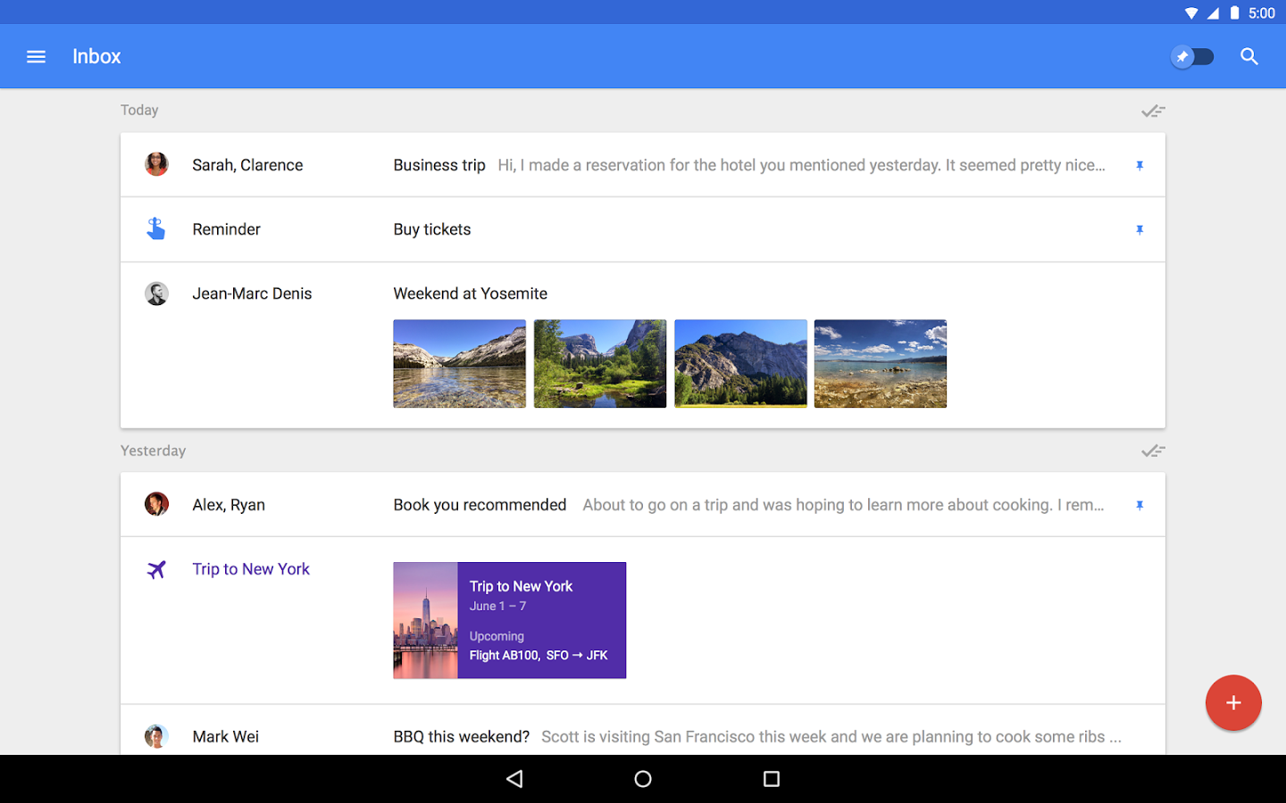
Gmail web interface
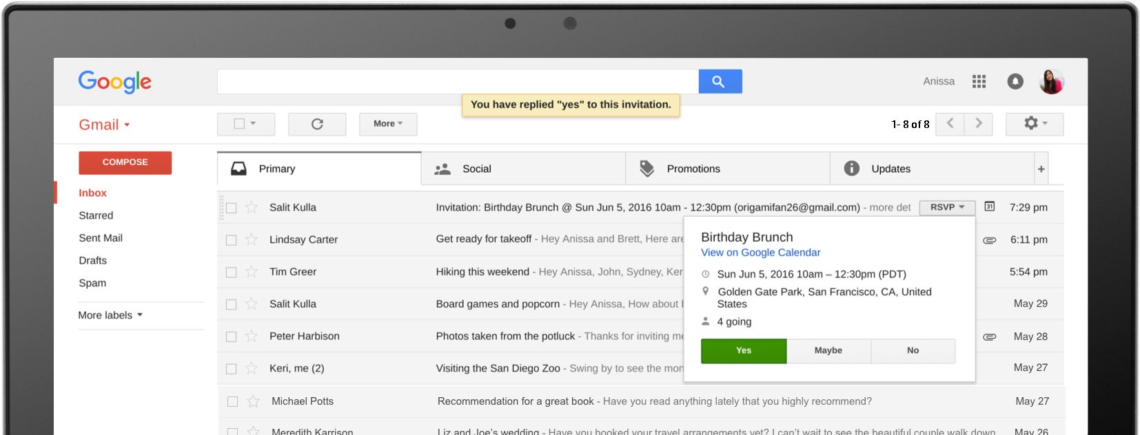
Web app for Gmail
Gmail mobile interface
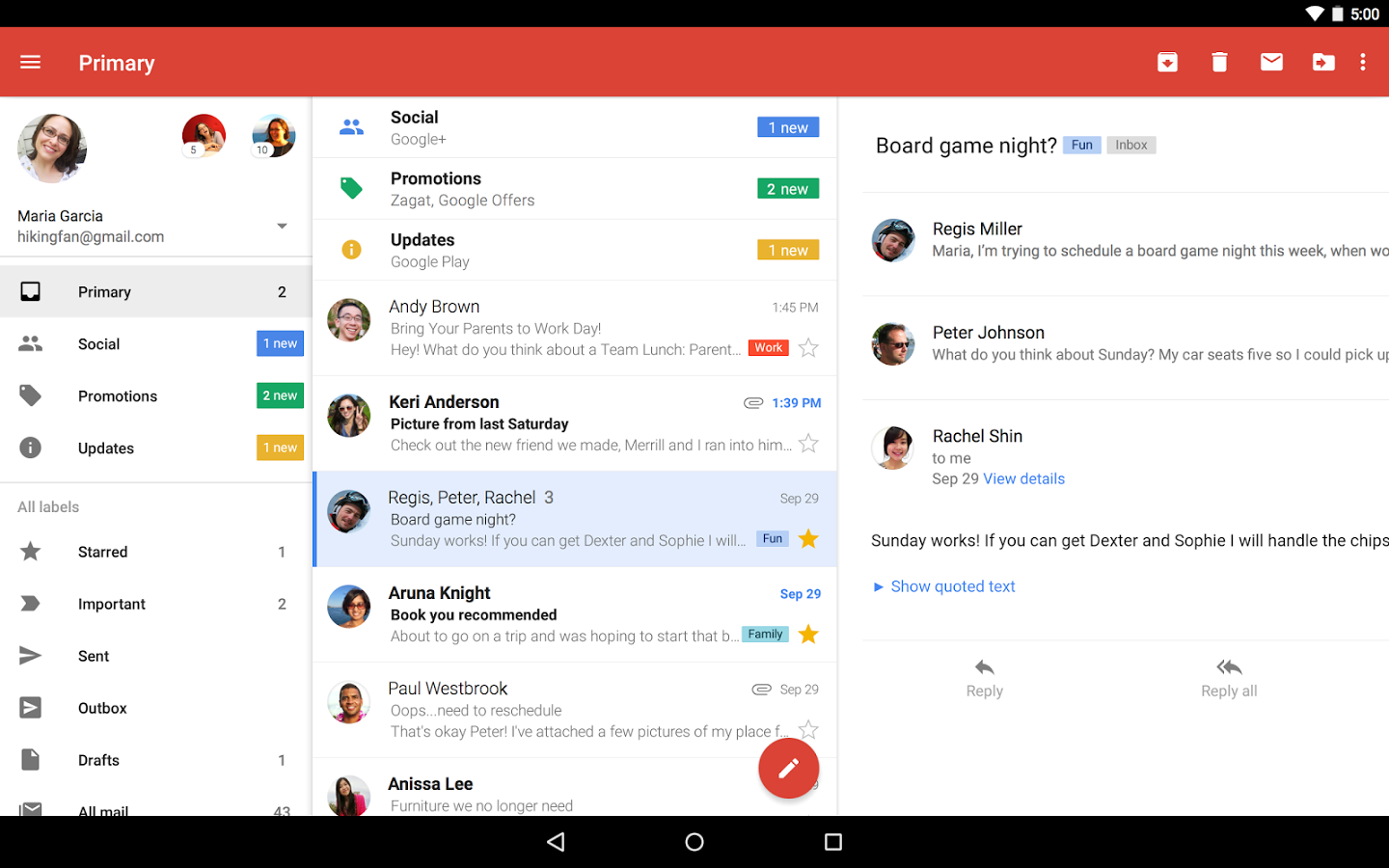
Mobile App for Gmail
I’m sure you can instantly see the difference. There’s no need to add a FAB on their web application because they understand the context of their users. If you’re using Gmail on the web, you’re using the product a lot differently compared to when you’re using it on the go.
But what about Inbox by Gmail
Inbox by Gmail
Why the difference?
To recap, now we’re comparing Gmail Web App, Gmail Mobile App and Inbox by Gmail.
Could it be that they haven’t gotten around to implementing material design into their Gmail web app interface? I highly doubt it. Could it be that they don’t want to mess up a good thing they’ve got going on already? Not the case most likely.
My gut tells me Google created Inbox as a way to test everything they’ve learned from Gmail for their personal power users. It’s not all about Google Material design. It’s a whole concept on cleaning up the noise that email brings to each of us every day.
I truly think a company like Google understands their users, how they are consuming vs. taking action and they understand the context of users intentions.
Design responsibly & harness design trends
You know how marketers ruin everything? They ruined email, they ruined SEO, they ruined paid search, they ruined social media and will most likely ruin the next thing. Let’s try to not ruin these design trends by using them without context, without understanding their purpose or why they were created.
Think before you FAB and design responsibly.